In the world we live in right now it is really difficult to tell apart a lackluster half-done job terribly failing expectations from a desperate approach to a negative publicity stunt. From Pepsi’s more than suggestive over exaggerated, almost extra terrestrial explanation for their new logo design to the lesser exaggerated controversy over the new Jaguar logo, it has become really difficult to justify a logo in the emerging brutal and bold culture of design in the recent times.
And then comes the new talk of the town JioHotstar. Now I will go out on a limb and say that this might not be the best logo I have seen but also not the worst. Coming to the crucks of it, seems like a love child of cliq fashion and the old age conceptual representation of Kiki from the wiki page kiki and Booba. Now it always has been in our primal nature to find similarities between things where it doesn’t exist and we are sure to find ones when we go out looking for it but my stand inclines more towards the imbalanced structure, uninspired design and lack of emotional connection that the logo has with its audience.


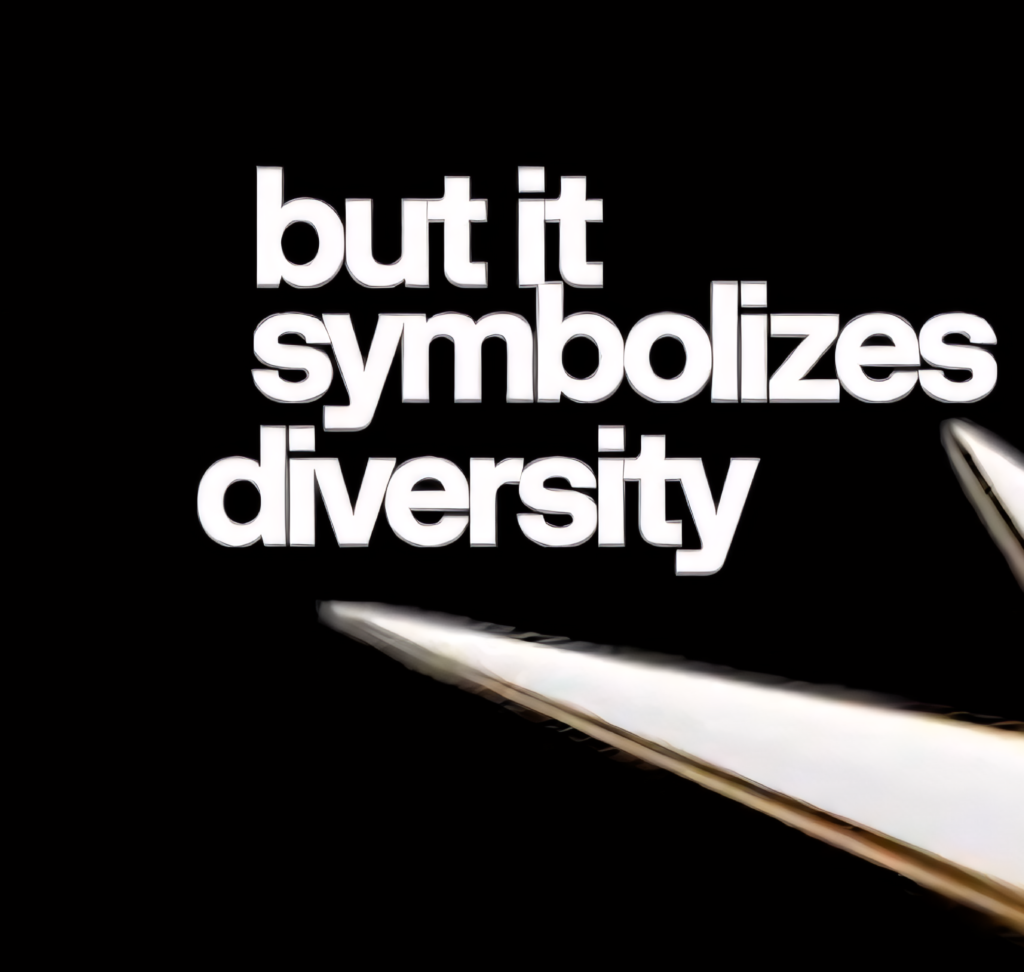
Stretching few spikes of the logo out of proportion in the name of diversity and inclusiveness it a bit of a stretch for me as well and something that is not very evident from the over all look and feel of the logo. Also the proportions between the logo mark and the logo type seems out of balance, use of outdated gradients and unfriendly shapes to create unnecessary white spaces inside the logo unit creates graphical noise at smaller scales. In short, the logo doesn’t look good when its small. Recalling the legend Paula Scher herself for the design of the Citi bank merger with axis umbrella where the new identity was designed with the features of the parent brands giving a clear message, this rebranding falls short in every aspect when it comes to imbibing the features of the parent brands.
Now if it was any other B-grade brand I would have ignored it but for a brand like Jio to succumb to inferior design choices and approving such a design surely doesn’t feel worth the negative publicity that they are currently getting and here comes my biggest issue with the logo – which is not the logo itself rather the intensions behind it. A planned negative publicity, a desperate attempt to ride the trend-wagon or just a out cry from the failed state of design industries in India.
“Everything is designed. Few things are designed well.”
Brian Reed
Times like these makes us appreciate the effort that went into making the age old logos which still stand with pride in this over crowded market were designers are becoming very comfortable in using words like minimalistic, clean, simple, modern as a veil to hide their lack of design acumen. It is high time we start appreciating art for the effort and craftmanship that goes into it rather than giving a free pass to the people using the minimalistic tag to justify their next Instagram sticker slapped over a word mark calling it a logo.

